| Menu |
|
Main • Index Browse • Screenshots • Old News Submit • Screenshot • News Discuss • Forums |
| Search |
| Styles Packs |
| Download all 2693 styles upload to the site as of 08 February 2020! |
| Links |
Windows Shells   *nix Window Managers Blackbox FluxBox Styles NC-17 Pitkon To Us  |
| « Next | EliTe-Grey by Red-EliTe | Prev » | ||
 |
User | Red-EliTe |
| Notes | ||
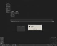
| well this is my style i came up with from 2 different peoples' submissions... So credits goto thewayofzen because I based my menu off his 'primary' style, I just changed the colors and reversed the bevels... another goes to NightBreed for convincing me to try some 'in depth' bbinterface and his 'litestep bar'... now that I'm done with credits... this is my first attempt at a greyscale style, my first attempt at creating switch buttons and multiple rc files in interface, and my first attempt at using broams... but this is what i came up with... (1)bottom right switch "<" hides everything except for that switch... (2)2 switches for extras and mixer in mainbar... and finally a toggle tray button that uses broams to show the tray in the systembar... also I'm still trying to get 3dc down so if you dont like the 3dc in it u can delete the code from the style... so lemme know what you guys think... Enjoy! Red-EliTe | ||
| Shell | BBLC\BBLean | |
| Style | EliTe-Grey by Red-EliTe | |
| Wallpaper | ||
| Comments | |
| freeb0rn | Probably one of the better dark styles out there. |
| thewayofzen | im not sure where i get credit on this at all but i must say its a very impressive desktop.. KUDOS! |
| RedEliTe | zen: you get credit because i based my menu and my windowU/F on your primary style i just tweaked maybe 2 or 3 things... both: thanks for comments |
| qwilk | Kickass greyscale style! Not sure about the yellow indicators, but given that you're using bbLean maybe that wasn't intentional? (I don't think menu.indicator/separ ator is supported by bbLean, right?) |
| RedEliTe | yeh seperator isnt in bbLean like xoblite... i noticed that... i like those seperators too vs the blank space... |
|
© 2003-2006, Brian "Tres`ni" Hartvigsen, Jesterace, snkmchnb and NC-17 Styles © of their respective authors Please direct all administrative questions/comments to Jesterace, snkmchnb or NC-17 |
| Random Screenshot |
 ‡ • Lord E. • 9 |
| Style Switcher |
 • •
 • •
  • •
 • •

|
| Chatbox |
| Valid BBCode: [b][u][i][url] |
|
pitkon 2025-04-18 05:40 For some reason, now I can't comment under screenies. pitkon 2025-04-18 05:32 Hi again, friends! So good to c u again, Brian. Karl, the screenies function wasn't broken, just needed approval. I AM moderating, from time to time :) How do u think those newer screenies got up in the first place? :D tresni 2025-04-17 10:52 uploading works, but uploads always require approval and I don't think any of us are as actively moderating as we did in the past ;-) snkmchnb 2025-04-16 12:49 qwilk: that's exactly what I was wanting to get done :D tresni 2025-04-16 09:25 qwilk - All pending screenshots approved :) tresni 2025-04-16 09:20 I do check in from time to time :D I didn't realize it was broken. I can try to take a look qwilk 2025-04-15 11:56 Hey old friends, another old-timer hanging on here :) snkmchnb: Do you think it would be possible to get this site's screenshot posting function going again with Brian's help? (read: not sure if he'll be reading this himself so asking any other admins more broadly) snkmchnb 2025-04-14 11:59 glad to hear, pitkon. pitkon 2025-04-14 03:08 Sorry folks, been away, blackbox4windows.com has been attacked by spammers and I had to shut it down. Will be up again later in the year, hopefully. All of you old friends (and new ones) you can contact me at blackbox4windows@gmail.com Happy to see many of my old friends are still around. Bless you! thedaemon 2025-03-24 18:45 Thanks for keeping this site alive! |
| Chatbox History |