| Menu |
|
Main • Index Browse • Screenshots • Old News Submit • Screenshot • News Discuss • Forums |
| Search |
| Styles Packs |
| Download all 2693 styles upload to the site as of 08 February 2020! |
| Links |
Windows Shells   *nix Window Managers Blackbox FluxBox Styles NC-17 Pitkon To Us  |
| « Next | WinBe by ser VI | Prev » | ||
 |
User | ser VI |
| Notes | ||
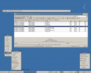
| Just playing around with the Windows Classic Theme | ||
| Shell | BBLC\BBLean | |
| Style | WinBe by ser VI | |
| Wallpaper | bsetroot | |
| Comments | |
| ser VI | I made some changes in this style and added some other colors: WinBe II |
| mini-man | Clean. |
| iTiVO | Am not sure about the shadow on the active parts. Maybe a x1 and y1 would be enough, the rest is, what minman said, clean. |
| ser VI | Maybe a litle exaggerated in the shadow space, but I want this effect to really appears, so I used this way. I like how it looks like is in another level, the 3D effect, you can quickly see what is active, and give another personality to the windows classic style. |
| Omni | The text shadow effect on the menus is circumspect. Toolbars, titlebars, excellent, but I don't know about the menu text shadows. Every option just looks so...shadowy. I like the active highlight shadow, though, adds to the 3D look. Just wish the other text shadows weren't so...prominent. |
| ser VI | I think is the resolution of my comp: 1280x1024 that makes me like this style the way it is. Life is prominent (sorry!) |
|
© 2003-2006, Brian "Tres`ni" Hartvigsen, Jesterace, snkmchnb and NC-17 Styles © of their respective authors Please direct all administrative questions/comments to Jesterace, snkmchnb or NC-17 |
| Random Screenshot |
 ‡ • Arc Angel • 5 |
| Style Switcher |
 • •
 • •
  • •
 • •

|
| Chatbox |
| Valid BBCode: [b][u][i][url] |
|
pitkon 2025-04-18 05:40 For some reason, now I can't comment under screenies. pitkon 2025-04-18 05:32 Hi again, friends! So good to c u again, Brian. Karl, the screenies function wasn't broken, just needed approval. I AM moderating, from time to time :) How do u think those newer screenies got up in the first place? :D tresni 2025-04-17 10:52 uploading works, but uploads always require approval and I don't think any of us are as actively moderating as we did in the past ;-) snkmchnb 2025-04-16 12:49 qwilk: that's exactly what I was wanting to get done :D tresni 2025-04-16 09:25 qwilk - All pending screenshots approved :) tresni 2025-04-16 09:20 I do check in from time to time :D I didn't realize it was broken. I can try to take a look qwilk 2025-04-15 11:56 Hey old friends, another old-timer hanging on here :) snkmchnb: Do you think it would be possible to get this site's screenshot posting function going again with Brian's help? (read: not sure if he'll be reading this himself so asking any other admins more broadly) snkmchnb 2025-04-14 11:59 glad to hear, pitkon. pitkon 2025-04-14 03:08 Sorry folks, been away, blackbox4windows.com has been attacked by spammers and I had to shut it down. Will be up again later in the year, hopefully. All of you old friends (and new ones) you can contact me at blackbox4windows@gmail.com Happy to see many of my old friends are still around. Bless you! thedaemon 2025-03-24 18:45 Thanks for keeping this site alive! |
| Chatbox History |