| Menu |
|
Main • Index Browse • Screenshots • Old News Submit • Screenshot • News Discuss • Forums |
| Search |
| Styles Packs |
| Download all 2693 styles upload to the site as of 08 February 2020! |
| Links |
Windows Shells   *nix Window Managers Blackbox FluxBox Styles NC-17 Pitkon To Us  |
| « Next | arboreal by crowmag | Prev » | ||
 |
User | crowmag |
| Notes | ||
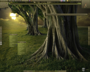
| A more recent style. Link to the wall is in the style file. | ||
| Shell | BBLC\BBLean | |
| Style | arboreal by crowmag | |
| Wallpaper | ||
| Comments | |
| thewayofzen | those menus are KICK ASS |
| skwire | Phenomenal style. |
| thewayofzen | /me agrees with skwire. i love the menus as ive already stated but the rest of this style is easily a contender for best submission to this site in a while. |
| Lord E. | Wonderful. |
| crowmag | Wow! Thanks guys! This one didn't come easy, I liked the wall but, after a couple of tries I was getting nowhere. Then, I found this service: link which, along with my color picker, lead to what you see. I just couldn't nail the right colors with my color picker alone for some reason. Obviously I'll be using the service more often in future. |
| snkmchnb | very well done. |
| ElTorqiro | This is awesome mate. How do you do the shadows on the menu text? Or am I imagining shadows? |
| ElTorqiro | Oops, never mind my last question, I read the answer in one of your other styles - BBClean. |
| mini-man | Not my colors, but it's all very well put together! As twoz said, nice menus...o.O |
| kxcastillo | crowmag, Im actually a fan. Not only with your styles, but with bbleantheme as well. Cheers -karl |
| crowmag | Thanks snkmchnb, ElTorqiro and kxcastillo - sorry for the lag in response time, I did a HD change out that didn't go as smoothly as expected so I haven't been connected for a few days. |
| Downtown | I was starting to get worried about the drought around here, but this is a great great style crowmag. Hope to see more from you later. |
|
© 2003-2006, Brian "Tres`ni" Hartvigsen, Jesterace, snkmchnb and NC-17 Styles © of their respective authors Please direct all administrative questions/comments to Jesterace, snkmchnb or NC-17 |
| Random Screenshot |
 ‡ • oldskull • 11 |
| Style Switcher |
 • •
 • •
  • •
 • •

|
| Chatbox |
| Valid BBCode: [b][u][i][url] |
|
pitkon 2025-04-18 05:40 For some reason, now I can't comment under screenies. pitkon 2025-04-18 05:32 Hi again, friends! So good to c u again, Brian. Karl, the screenies function wasn't broken, just needed approval. I AM moderating, from time to time :) How do u think those newer screenies got up in the first place? :D tresni 2025-04-17 10:52 uploading works, but uploads always require approval and I don't think any of us are as actively moderating as we did in the past ;-) snkmchnb 2025-04-16 12:49 qwilk: that's exactly what I was wanting to get done :D tresni 2025-04-16 09:25 qwilk - All pending screenshots approved :) tresni 2025-04-16 09:20 I do check in from time to time :D I didn't realize it was broken. I can try to take a look qwilk 2025-04-15 11:56 Hey old friends, another old-timer hanging on here :) snkmchnb: Do you think it would be possible to get this site's screenshot posting function going again with Brian's help? (read: not sure if he'll be reading this himself so asking any other admins more broadly) snkmchnb 2025-04-14 11:59 glad to hear, pitkon. pitkon 2025-04-14 03:08 Sorry folks, been away, blackbox4windows.com has been attacked by spammers and I had to shut it down. Will be up again later in the year, hopefully. All of you old friends (and new ones) you can contact me at blackbox4windows@gmail.com Happy to see many of my old friends are still around. Bless you! thedaemon 2025-03-24 18:45 Thanks for keeping this site alive! |
| Chatbox History |