| Menu |
|
Main • Index Browse • Screenshots • Old News Submit • Screenshot • News Discuss • Forums |
| Search |
| Styles Packs |
| Download all 2693 styles upload to the site as of 08 February 2020! |
| Links |
Windows Shells   *nix Window Managers Blackbox FluxBox Styles NC-17 Pitkon To Us  |
| « Next | Think Music by Nightbreed | Prev » | ||
 |
User | Nightbreed |
| Notes | ||
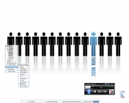
| For all you minimal folks :P | ||
| Shell | BBLC\BBLean | |
| Style | Think Music | |
| Wallpaper | Think Music | |
| Comments | |
| Pitkon | Minimal AND pretty - an unusual sight, at least to me, who usually can't stand minimal things... Good work again, Gary... |
| jimmy | This is very nice... I like menus ;) |
| ArthurDent | NB: Is that an actual Winamp skin or something of your creation? |
| Nightbreed | Thanks Pete, Jimmy :) Arthur, that is my current script in progress.. some info on it is located here: link |
| satori | minimalist = nice :). Very nice, Nightbreed. |
| Nightbreed | Believe me Pete, I can't stand minimal either.. well, not 'can't stand' but more, doesn't fit my work flow. I did this to test transparencies and masking techniques on the toolbar, which is systembarEX wrapped in bbi with a method I described in the same link above.. :D |
| Nightbreed | Thanks Satori :) |
| sMs | this is so different from ur all styles.. this is so much better from u ;) |
| smS | very niceice winamp controls,,,, impressive |
| F1LeX | I like minimalism. You are really CooL. How you did icons in menus? |
| Nightbreed | thanks smS. thanks F1LeX, icon info can be found here: link |
| Roots | Nice :D like the winamp controls, very cool wallpaper too |
| lexxca | i like this too, nice harmonic with back and menu transparenz...and bright/blue combo fine fine fine ;) |
| Nightbreed | Thanks Roots, Lexxca :) |
| kopf | I need this theme!! Absolutely beautiful work. |
|
© 2003-2006, Brian "Tres`ni" Hartvigsen, Jesterace, snkmchnb and NC-17 Styles © of their respective authors Please direct all administrative questions/comments to Jesterace, snkmchnb or NC-17 |
| Random Screenshot |
 ‡ • iTiVO |
| Style Switcher |
 • •
 • •
  • •
 • •

|
| Chatbox |
| Valid BBCode: [b][u][i][url] |
|
qwilk 2025-04-19 14:45 Thanks Brian & Co! :D pitkon 2025-04-18 05:40 For some reason, now I can't comment under screenies. pitkon 2025-04-18 05:32 Hi again, friends! So good to c u again, Brian. Karl, the screenies function wasn't broken, just needed approval. I AM moderating, from time to time :) How do u think those newer screenies got up in the first place? :D tresni 2025-04-17 10:52 uploading works, but uploads always require approval and I don't think any of us are as actively moderating as we did in the past ;-) snkmchnb 2025-04-16 12:49 qwilk: that's exactly what I was wanting to get done :D tresni 2025-04-16 09:25 qwilk - All pending screenshots approved :) tresni 2025-04-16 09:20 I do check in from time to time :D I didn't realize it was broken. I can try to take a look qwilk 2025-04-15 11:56 Hey old friends, another old-timer hanging on here :) snkmchnb: Do you think it would be possible to get this site's screenshot posting function going again with Brian's help? (read: not sure if he'll be reading this himself so asking any other admins more broadly) snkmchnb 2025-04-14 11:59 glad to hear, pitkon. pitkon 2025-04-14 03:08 Sorry folks, been away, blackbox4windows.com has been attacked by spammers and I had to shut it down. Will be up again later in the year, hopefully. All of you old friends (and new ones) you can contact me at blackbox4windows@gmail.com Happy to see many of my old friends are still around. Bless you! |
| Chatbox History |